In post 96, Dunnstral wrote:Why does it need a box at all? That looks better than the wood though
my first versions looked terrible before i added the box, although that might have only been the case for the wood background. it actually looks pretty decent without one with the gradient background.
here are some (i hope) better colored gradients, boxed and boxless:
In post 100, chamber wrote:I don't think the same logo was used in sepia, was it?
the original sepia logo has black text with white and red drop shadows for "mafia" and "scum", hence my initial designs for the wood style having similar elements
i could try a different red, you're right in that i just sort of carried the same color over when trying colored text instead of shadows without thinking about if it made sense
just my onion but i think pictographs in the logo is out. minimalism is IN (if u look at like startup logos lol)
the font i used is called grenze gotisch except i did a little editing myself for the sharp ends because we are edgy lmao
must i have a gender.. is it not enough for me to simply b kinda hot sometimes
In post 97, Davsto wrote:I just think that font in lowcaps makes the a's look really out of place. the m's and c have smooth tops but the a doesn't and it looks odd.
the "f", "u", and "c" (lol) all also have flat elements, although you're right that the "a" definitely stands out the most
In post 103, Dunnstral wrote:It looks like the colored gradient is trying to mimick what being transparent would do
i hadn't considered just straight up transparency on the icons one, i'll try it.
yeah, the transparency is probably just better than the gradient, the header already has a gradient so it's a little pointless.
In post 105, caledfwitch wrote:just my onion but i think pictographs in the logo is out. minimalism is IN (if u look at like startup logos lol)
the font i used is called grenze gotisch except i did a little editing myself for the sharp ends because we are edgy lmao
we're an online forum started in 2002. are we really "in" anyways?
In post 106, xRECKONERx wrote:agreed about minimalism and not having iconography in the logo, maybe make the I in mafiascum the magnifying glass?
tried to do this but couldn't find a way to really make it work although thats not me saying it couldn't be done
In post 105, caledfwitch wrote:just my onion but i think pictographs in the logo is out. minimalism is IN (if u look at like startup logos lol)
the font i used is called grenze gotisch except i did a little editing myself for the sharp ends because we are edgy lmao
we're an online forum started in 2002. are we really "in" anyways?
i mean we can do a little better. update our wardrobe you know?
epicmafia's logo still looks like this lmao (NOT TO DUNK)
Spoiler: since its transparent it wont look good if you use mafblack
must i have a gender.. is it not enough for me to simply b kinda hot sometimes
expert is a stretch haha. i was just drilled in my head that designs should """conform to modern design standards""" but if we wanna go vintage thats fine
must i have a gender.. is it not enough for me to simply b kinda hot sometimes
if you have to do specific logos for specific skins
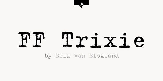
doesn't a typewriter font make more sense for sepia?
maybe typewritten on old paper and a blood stain or something?