Logo Design Competition/Collaboration (Survey, last page)
-
Bingle

-
Bingle Survivor Bingle
- Survivor
- Survivor
- Posts: 10442
- Joined: July 21, 2019
- Location: Bad Player Jail
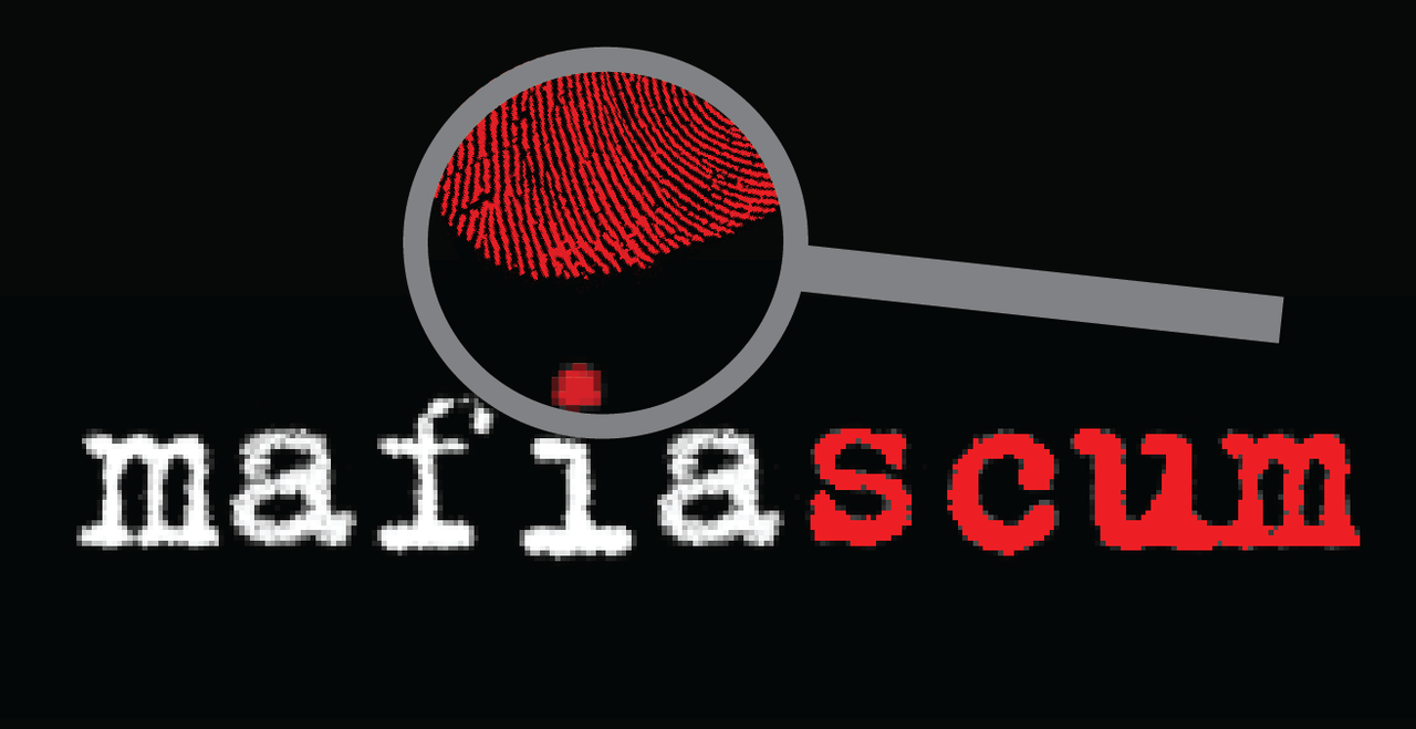
The flat top on the M looks a little weird to me. Could also experiment with the magnifying glass being at an angle (the handle angled away from the s)."He brings the cool and the muscle" -FakeGod
"I was playing against the timer known as bingle tbh." ~Chennisden
"it's truest in mechanical games (if he gets a gritty setup and is town in it and needs to save the day, he starts levitating and his eyes start glowing. not exaggerating, it literally happens)." ~Ducky-
Bingle
-
Bingle Survivor Bingle
- Survivor
- Survivor
- Posts: 10442
- Joined: July 21, 2019
- Location: Bad Player Jail
I get this wasn’t serious but I actually really like the halo effect inside the magnifying glass here. I also like the block text i after nsg pointed out her reasoning. Still not a huge fan of the M, but the perfect is the enemy of the good and all that.In post 202, northsidegal wrote:
doneIn post 201, Not_Mafia wrote:Merge these two and use that
Spoiler:"He brings the cool and the muscle" -FakeGod
"I was playing against the timer known as bingle tbh." ~Chennisden
"it's truest in mechanical games (if he gets a gritty setup and is town in it and needs to save the day, he starts levitating and his eyes start glowing. not exaggerating, it literally happens)." ~Ducky-
Bingle
-
Bingle Survivor Bingle
- Survivor
- Survivor
- Posts: 10442
- Joined: July 21, 2019
- Location: Bad Player Jail
+1In post 241, shaft.ed wrote:lower case
and a sans serif font so that the i looks a tiny bit more person-like
I think playing with the orientation of the magnifying glass could make it a bit more discrete from the text
right now the handle is too close
Doesn’t need to be a steep angle, 15 degrees is prob sufficient."He brings the cool and the muscle" -FakeGod
"I was playing against the timer known as bingle tbh." ~Chennisden
"it's truest in mechanical games (if he gets a gritty setup and is town in it and needs to save the day, he starts levitating and his eyes start glowing. not exaggerating, it literally happens)." ~Ducky-
Bingle
-
Bingle Survivor Bingle
- Survivor
- Survivor
- Posts: 10442
- Joined: July 21, 2019
- Location: Bad Player Jail
"He brings the cool and the muscle" -FakeGod
"I was playing against the timer known as bingle tbh." ~Chennisden
"it's truest in mechanical games (if he gets a gritty setup and is town in it and needs to save the day, he starts levitating and his eyes start glowing. not exaggerating, it literally happens)." ~Ducky-
Bingle
-
Bingle Survivor Bingle
- Survivor
- Survivor
- Posts: 10442
- Joined: July 21, 2019
- Location: Bad Player Jail
?
Not all players in a game of mafia are scum though. If all the text under the magnifying glass is red, it's just a colored lens, not a revelation that one of the players is EVIL or a tool that helps with deduction."He brings the cool and the muscle" -FakeGod
"I was playing against the timer known as bingle tbh." ~Chennisden
"it's truest in mechanical games (if he gets a gritty setup and is town in it and needs to save the day, he starts levitating and his eyes start glowing. not exaggerating, it literally happens)." ~Ducky-
Bingle
-
Bingle Survivor Bingle
- Survivor
- Survivor
- Posts: 10442
- Joined: July 21, 2019
- Location: Bad Player Jail
No. If I have a thought about what colors might be better I will post that I think maybe those colors might be better, in case that inspires someone who isn't me to look at the colors and improve the design. In exchange, I also give up any rights to complain should people completely ignore my suggestions or mith choose a logo I dislike. (Not that I really have much say if mith chooses a logo I dislike in the first place.)In post 297, chamber wrote:its easy to try out different colours yourself.
Speaking of which:
I personally like the grey, but if there's a legitimate need to change it probably a metallic color would be best. Silver, maybe? Potentially brown, although I don't think brown would go well with the red lettering. I think anything ROYGBIV would just look unnatural. If someone wanted to be super spicy they could make a wooden handle texture, but honestly I doubt such a texture would show up well on as small a scale as the logo will likely be.In post 275, caledfwitch wrote:do you have any suggestions for a different color instead of grey?
On a merch note, it'd be cool to see a rainbow colored version of the logo for shirts/hoodies/etc given our large LGBTQ etc. population and emphasis on making this a place where such people can congregate and feel welcome. Assuming of course that the site does a shirt/hoodie/etc. order sometime in the near future."He brings the cool and the muscle" -FakeGod
"I was playing against the timer known as bingle tbh." ~Chennisden
"it's truest in mechanical games (if he gets a gritty setup and is town in it and needs to save the day, he starts levitating and his eyes start glowing. not exaggerating, it literally happens)." ~Ducky-
Bingle
-
Bingle Survivor Bingle
- Survivor
- Survivor
- Posts: 10442
- Joined: July 21, 2019
- Location: Bad Player Jail
I actually kinda like this. I think the magnifying glass with the rounded handle that's been being used looks a little better, but I do like the typewriter effect and I think it's worth exploring combining the two.In post 310, shaft.ed wrote:don't really like this and yes its a terrible magnifying glass
but I figured I post it anyways
Spoiler:
It could maybe help with providing a barrier to prevent the mafias cum issue with sepia that was brought up. If we use that fingerprint pattern we don't necessarily need the magnifying glass to be over the I either.
Does it even matter? I think the takeaway is try to be mindful to post with the intention of suggesting improvements. If you're already doing that, keep on keeping on.Dunnstral wrote:Which begs the question: Who are caled, chamber, panthaleon even talking about?"He brings the cool and the muscle" -FakeGod
"I was playing against the timer known as bingle tbh." ~Chennisden
"it's truest in mechanical games (if he gets a gritty setup and is town in it and needs to save the day, he starts levitating and his eyes start glowing. not exaggerating, it literally happens)." ~Ducky-
Bingle
-
Bingle Survivor Bingle
- Survivor
- Survivor
- Posts: 10442
- Joined: July 21, 2019
- Location: Bad Player Jail
That reminds me of the text in silent movies, and I’m a little in love with that idea."He brings the cool and the muscle" -FakeGod
"I was playing against the timer known as bingle tbh." ~Chennisden
"it's truest in mechanical games (if he gets a gritty setup and is town in it and needs to save the day, he starts levitating and his eyes start glowing. not exaggerating, it literally happens)." ~Ducky
Copyright © MafiaScum. All rights reserved.